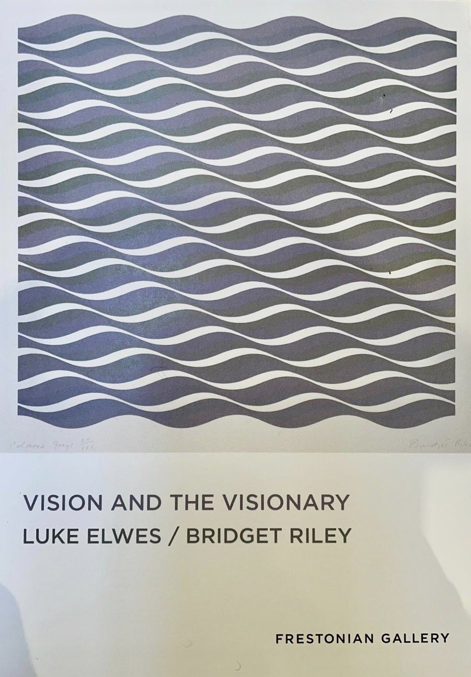
How to write about Tomma Abts? (2018)

Luke Elwes: How to write about Tomma Abts?

(Tomma Abts, at Serpentine Sackler Gallery, 7 June to 9 September 2018)

A good deal of speculative writing on Tomma Abts is devoted to fitting her paintings into certain established lineages, from hard edge abstraction (Ellsworth Kelly, Frank Stella) to Constuctivism (Archipenko) and geometric abstraction (Vasarely).

Essays published by the Tate Gallery and Parkett magazine both point to Jasper Johns, with his breaks, interruptions, and blurring of image and object; and the Tate goes further, namechecking Richter’s abstract paintings of the early 1980s, and tentatively trailing a notion of ‘transitive painting’ that places her within a postmodern culture informed by emergent technological and economic networks, before going on to problematize her work as ‘a hermetic practice with no reference to the outside world.’ (Godfrey, 2013, pp10-17)

Elsewhere, Frieze magazine posits the romantic notion of Abts as an artist creating something from nothing, employing a working process informed by ‘metaphysical concerns’ (Bedford, 2012, p.100); while ArtReview makes a connection with postmodern graphic designers of the 1980s (Charlesworth, 2012), and Adrian Searle admits to being simultaneously intrigued and mystified, displaced in much the same way as he was by the work of Raoul De Keyser.

All plausible suggestions, but where does any of this really get us?

Is the work retrogressive, or an art of the future? Does it represent a crisis for painting, or a solution?  Or perhaps – discarding binary oppositions for a moment – it is all these things. Suzanne Hudson, in Parkett, isn’t really sure either, beyond identifying ‘an obdurate materiality that remains impervious to translation (and that rushes to connect disparate objects in a great long historical continuum).’ (2009, pp.18-23)

The bulk of commentary on Abts’ work goes in search of ‘abstraction’, but doesn’t ever quite find it; indeed, the artist herself has said more than once that ‘I don’t see my work as abstract’. At the same time, however, she does her best to discourage looking for conscious allusions to anything outside the paintings: ‘I don’t really look at things while I am working. There is no reference material in my studio at all.’ (Abts, 2004)

As these lines of enquiry run into the sand, another one pursues a psychological tack, by regarding the paintings as images of mental states, or even as ‘portraits’ of a kind (the clue here being her recurring use of an intimate portrait format). Abts has pointed commentators in this direction (‘I think it relates to the size of a head space – a portrait type space’), but she immediately grounds this in technical concerns: ‘The vertical format holds the space tight. A landscape format would let the tension flow out on the sides’. (Grant, 2013, pp.24-25)

‘For me, painting is a concrete experiment that is anchored in the material I am handling’. (Bedford, 2012, p.100) Her concerns are physical, rather than metaphysical.

She paints lucid representations of a thing – which can never be the thing itself.  Just like words. Even the words she deploys as titles are untranslatable. Apparently ‘each title has a German name’ (Searle, 2005), but put them into Google translate, and they return only themselves as results. Maybe they are proper names pulled from a directory – but they seem as arbitrary as trade names for wallpaper or paint lines. Alternatively, they might be elements of an imaginary structure or private language. Either way, they are blunt syllables attached to sealed containers.

So words continue to circle and continue to miss their target. But then, how can you pin down, neatly categorize, these small geometric daydreams, these semi-conscious doodles?

As Hudson points out, ‘the paintings appear premeditated but not inevitable’. They result from unvoiced meanderings now buried within eerily crystalline forms: ‘I’m working from a somewhat indistinct and hazy notion towards a very specific and concrete image’ (2004).

Their origins are obscure, and their forms are strange: such is the lure of the uncanny.


Tomma Abts, at Serpentine Sackler Gallery, 7 June to 9 September 2018


References

Godfrey, M. (2013) ‘Tomma Abts’ in ‘Painting Now: Five Contemporary Artists, 2013, Tate Publishing, London, pp.10-17

Bedford, C.  (2012) ‘Dear painter…’, Frieze, 145, pp.100-101

Charlesworth, JJ. (2012) Tomma Abts, ArtReview, 56, Jan-Feb 2012

Searle, A. (2005) ‘Is Anyone there?, The Guardian, 13 December

Hudson, S. (2009) ‘The Best-Laid Plans’, Parkett, 82, pp18-23

Abts,T. and Doig,P. (2004)  ‘Conversation between Peter Doig and Tomma Abts’, exhibition publication, The Wrong Gallery, New York, pp12-16

Grant, S. (2013) ‘Tomma Abts in conversation with Simon Grant’ in

Julie Mehretu (2013)

Over the last decade, Julie Mehretu has become an art world star, her work shown at The Whitney and Guggenheim (New York and Berlin), purchased by MOMA (and prominently displayed near Barnet Newman’s obelisk) and fought over by collectors, one of whom even took her New York dealer to court after being denied ‘first refusal’ on a new picture. Now White Cube in Bermondsey, in conjunction with Marion Goodman Gallery in New York, is showing a quartet of monumental new works (Mogamma: A Painting in Four Parts), fresh from last year’s dOCUMENTA 13, alongside some pieces made earlier on this year.

Her work is being increasingly cited in the narrative of 21st Century painting – particularly by American curators and museums – as representing a sensibility and practice that’s both postmodern and post-abstract (even while it continues to reference the language of modern abstraction). With their multiple viewpoints and multiple visual languages, her paintings represent the protean complexity as well as the dematerialised nature of our speeded up urban world, its digital trace increasingly obscuring the physical architecture that still lies beneath it. Mogamma is everywhere and nowhere, a polyglot postcolonial multiplex, simultaneously interconnected and decentred. The manner of its making is also multiple: dependent on the skills of the illustrator and architectural draughtsman, the printmaker charged with colour schemes and the sander and polisher hired to produce the final ‘super-cool technical surface’. Alongside this technical fabrication (and the rapid rate of production it engenders), Mehretu filters her evolving images through the computer screen, a seemingly continuous process of correcting, adding and erasing her carefully layered creations that make the image’s final state all but impossible to locate.

Mogamma overlays a place (a government building in Tahrir square) with an idea (a communal arena containing diverse beliefs) and ties them to a moment of violent disruption. Through this multiple lens Mehretu references – both compositionally and metaphorically – the past, present and future. The architecture functions as both historic space and compositional grid; the haptic markings, random ink rubbings and ghostly erasures, replicate the strategies of high abstraction as well as symbolically disturbing the once classically ordered city square (the locus of authority and control); and floating above it all, like a plethora of web maps, her bold smooth lines and free floating shapes serve both to energize and disrupt any single reading of her ‘vertiginous panoramas’, suggesting the instantaneous connectivity, the dizzying complexity and disorientating noise, of our digital world. This is no longer a space or place but a stream of disembodied moments, an indelible trace on the future.

She amply displays that condition identified by David Sweet in which the abundance of graphic detail generated ‘in an era of high definition (one made possible by the technical & digital means at her disposal)… appears to be an increasingly important, even essential part of a contemporary pictorial strategy’. But while she evidently abjures the reductive impulse that runs through the lineage of a certain kind of abstraction, she retains through her layering, her ‘emergent algorithms’, both the formal device and generative potential of the grid and the gestural markings that came to typify other recognisable strands of abstract painting.

Her layered and dematerialised surfaces appear to connect to the physical world but seek only to reference rather than embody the material world and, in their intricate tracery, have no interest in engaging with ‘the thickness of existence’ that Mark Stone identifies as essentially lacking in our screen-dominated lives. There is little visual reward for those like Stone who are ‘drawn again and again, to thickness, to volume, to interior spaces’: no accretion of paint or material resistance, no unexpected tension or granular disturbance, nothing in fact to give the eye traction as it glides restlessly over the polished surface. Even the frenzied drawing is smoothed out, rendering it less a nervous bodily impulse as an encoded reference to human action. The layering diminishes rather than enhances any spatial dynamic, while the interference of one with another appears simultaneously arbitrary and too carefully controlled. The scattered lines, bold and colour-coded, suggest points of entry but start and finish nowhere, like so many dead ends. There is no narrative, only a profusion of details and cursory fragments that frustrate the viewer’s impulse to seek coherence or wholeness. Mogamma is a depthless virtual space that’s visually unsatisfactory when regarded through the traditional prism of abstract language.

But in another sense this is to deny the alluring power (as well as the unavoidable sense of recognition that Sam Cornish identifies) of its luminous white surface, one born out of ‘the glow of the screen and the infinite-shallow space’. The Mogamma quartet – ‘liminal squared’ in the gallery’s terminology – is a domain that does not respond to clear narrative reading or continuous time. Through what Brian Dillon identifies as her ‘increasingly atomised & aerated surfaces, the seeds of an as yet unfulfilled future’(1), Mehretu proposes that we realign our habitual terms of reference, reformulate our visual response, to recognise (or imagine) the as yet unfamiliar contours and nascent language of our accelerating urban world, with all its distracted energy, temporal slippages and nebulous structures. The material fabric beneath it has not disappeared from view; it recurs and repeats in increasingly attenuated form, but its relation to the virtual, to the ‘infinite-shallow’, remains undetermined. Her space (or non-space) is deliberately problematic: inherently un-resolvable and visually unstable. Whether or not we choose (depending on our chosen terms of reference) to regard this as extending, subverting or simply playing with notions of abstraction, it represents the future – or, perhaps more accurately, the present version of the future.

1. Brian Dillon, ‘An Archaeology of the Air’ in Julie Mehretu: Grey Area, Deutsche Guggenheim exhibition catalogue, New York: Guggenheim Museum Publications, 2009.

Other quotes are from the artist

Julie Mehretu: Liminal Squared, White Cube Bermondsey, 1 May – 7 July 2013.

Tess Jaray (2012)

Tess Jaray: Mapping the Unseeable

It is the surface of Tess Jaray’s work that first invites attention, with its flat, unmodulated, intense colours carefully designed to ‘glimmer and shimmer but not glitter’. But where the surface was once punctuated, rhythmically patterned, now it is punctured, opening up through its shadowed tracery a delicate spatial distance between two colour fields, the one occluding, or revealing, the other. The surface appears to hover over some unquantifiable depth.

Each picture is finely balanced, carefully wrought and self-sufficient. They aspire to formal purity (and seem to edge closer to this Platonic ideal through her recent use of screen printing and computer aided design) while acknowledging the impossibility of perfection. After all, a perfect square, a perfect design, has no vitality; it denies the trace of human experience. Approached as formal problems, they proceed intuitively, their personal geometry and chromatic energy serving to distil rather than dissipate their emotional charge.

The recent work in her show at The Piper Gallery falls neatly into three parts, each separated (despite their superficial similarity) by marked differences in scale, temperature and feeling. The first and largest group is made up of small squares, busily hung and clustered together much as they were when they left her studio walls. Individually hot and intense, they read collectively as a vibrant riff on Malevich’s Red Square, with each new iteration visibly disturbed and animated by the impact of the last. Some are stronger than others however: those with two or three colours work best, while those with four or more lose their tautness.

The second is a quartet of mid-size pieces (‘After Damascus’ in green, purple, yellow and red), which each deploy two colours of roughly equal intensity, with an oriental flavour which is distinctive to her work. Some recede, others advance; some carry you inward through windows or grills, while others rise out of their flat landscape to suggest patinated objects, mosaic forms or architectural plans. This sensual oscillation between line and curve, form and opening, gives way in the last part to a triptych of three large squares, the vertical tension in each being emphasised by their unequal division into two separate parts. The hues are quieter, cooler, the effect more austere and poignant.  While there is a passing nod to Newman’s zips and Matisse’s openings, the language is substantially her own; stripped of the radiant intensity of the smaller works, their expanses of milky light and opaque shadow conjure a space where brilliant day gives way to the silent hours of dawn and dusk, before finally retreating into darkness, into that physical and metaphorical realm ‘in the middle of the night’.

Note: the short quotes are her own, from “Painting: Mysteries & Confessions’ (Lenz Books 2010). 

Cecily Brown (2011)

A Wrong Turn? : Cecily Brown at Gagosian

Who is to say, when a painter adopts the language of abstraction, its well-worn mannerisms, that what they produce is not abstract?  Who has the authority to judge, to define the parameters that separate true from false practice?  What divides the dedicated purist from those who dabble at the margins (particularly when dabbling could be read as the playful subversion of high modernism)?

Perhaps all one can ask is that there is a program of sorts, one that marks a continuity of purpose or a linear progression in a painter’s work; but this becomes problematic when you witness an artist jumping the tracks, as Bomberg, Guston and many others have done. What looks like a determined path later on is often an uncertain journey at the time.  It is the same problem posed by Cecily Brown’s new paintings, by the notionally figurative painter trespassing on abstract territory. Celebrated early on for the way she carried the gestural mark making of Abstract Expressionism into the territory of female sexuality, a decade on she appears to have lost her way.

Here and there she replays her familiar psychosexual dramas, the turbulent brushwork fusing naked flesh with fecund nature. ‘Lost Satyr’ for example reads like the frenzied aftermath of  ‘Le Dejeuner sur l’herbe’, while the large triptych (‘Have you not known, have you not heard’, 2011) exudes lusty energy, despite the scattered body parts being washed away in a torrent of scarlet and chocolate brown paint.  But elsewhere the new work looks flaccid, with marks lost in an abstract welter that conceals a lack of decision, as though simply by loosely arranging gestural brush strokes they will magically resolve themselves into postmodern images. ‘Grave Suave Singing Silk’ (2011) consists of indeterminate patches of grey, black and purple, and without any graphic clarity gives the eye nothing to alight on.  If the suggestive passages of flesh are removed, what are we left to look at?  The paint needs either to describe something or else assume a life of its own.  As it is, they amount to abstraction as the absence of figuration, a lazy solution delivered to deadening effect.

If there is any sense of progress, it is in two smaller works, which are stronger for being more slowly realised.  ‘The Fox and Geese’, 2008-11, is both more cryptic and staccato in its rhythm of dots and dashes, in its frenzied tracks of predator and prey. ‘The Tribulations of the Tablecloth’, 2006-11, is also less clotted, more nuanced.  All vestige of figuration has gone, leaving areas of paintwork to collect and dissolve on a pale field. It is I think the only image that lives up to her wish to balance formal complexity with visual chaos.

This may, if one is generous, represent a transitional moment in her work.  But mostly it’s a mess, an abstract turn that reads as a wrong turn.  How much better to have resolved the issue before showing the work.  As it is, her wish to ‘avoid using the terms figuration and abstraction because I’ve always tried to have it both ways’ has led her up a blind ally.  If she was serious about developing a distinctly corporeal abstract language of her own, she should have waited. One is left with the impression that she (or her gallery) is in too much of a rush to give it serious thought. What a shame.

Cecily Brown showed at Gagosian Gallery, Davies Street, London, June 8 – July 29, 2011

Cy Twombly (2004)

Twombly and Gagosian (Galleries Magazine, June 2004)

Behind a cool smoked glass screen down an anonymous side street in Kings Cross lies one of the newest and largest galleries in London.  Although its setting may resemble W24th street in Manhattan, in truth there is something about the awesome scale and uniformed security which is a million miles away from the chaos of building work and traffic noise that surrounds it.  Here taste and money bear down on you, demanding a willing compliance with it’s big gun status.

On four giant walls hang ten large paintings by the oracular master Cy twombly, each encased in a wooden frame washed in gun metal grey that seems only to reinforce the creeping sense of unease at daring to disturb the sepulchral stillness of this giant mausoleum.  It  makes a stark contrast to the airy classicism and generous green vistas of the Serpentine gallery, where a survey of the last half century of Twombly’s work recently ended.  The ludic quality of his work on paper is quite absent in these new paintings, all completed this year, all the same size and all resolutely untitled.  The variety and speed of his mark making has here been reduced to a more singular and stately pace.  The colours too are spare and uniform, a combination of  dark sepia, duck egg blue and flat white.  The vibrant tints of his most recent works on paper  are absent, the feint traces of rose and lemon in one of the new paintings all but obliterated.  There are a few Twombly signature marks - the hand smears impressed on knots of paint,the apparently careless dribbles left to run their course - but not many.  The range is decidedly narrow.  Almost entirely gone is the scriptural dimension, the sharply incised letters and teasing incantations.  The large brown marks  hang mutely in space, as though from the hand of a giant calligrapher, but without the suggestive power of this erstwhile cryptographer.  You don’t search as you once might  have for occluded meaning, the urge to decipher diminished by the physical unravelling of the code as the paint work slumps and dissolves. He’s like a Zen master who in the pursuit of nothing chooses to write in the pouring rain.  And the vertical drips slow these pictures down where once a diagonal thrust could energise the clusters of pigment in their peculiar groupings on empty grounds.  Now everything floats evenly in aqueous space, with unfolding shapes that suggest root- like tendrils or seaweed, or even mud bloated worms in tidal shallows.  The underbelly of Monet’s waterlilies, whose scale and serenity they possibly seek to echo.  And there are other echoes too.  The flat house paint  and grand gestural structures of Franz Kline are somewhere in here, a reminder of Twombly’s famous lineage, while something in the sober tones and attenuated forms returns the onlooker to the simple rough hewn totems of his north African drawings of fifty years ago.  Occasionally you sense  an affinity  with the  loose  meanderings of de Kooning’s last paintings.  However there is something wise in these late works, a kind of mystical emptiness that eschews the sublime. We are still rooted in phenomenal matter.

But if they  remain essentially true to his child like impulses, they are nevertheless at odds with their value as icons, and it is this other level of meaning which predominates. While the eye registers filaments of house paint on hardboard the head knows that it is a desirable objects for the few that they are here paraded.  While Cy Twombly’s own inimitable signature is pencilled high up on one of his panels, Larry Gagosian’s large name hovers with predatory elegance on the face of the building and the market place.

Luke Elwes 2004